Three Lessons for Building a Strong Website When Time Is Tight
By Marianna Sachse, January 16, 2015
 -->
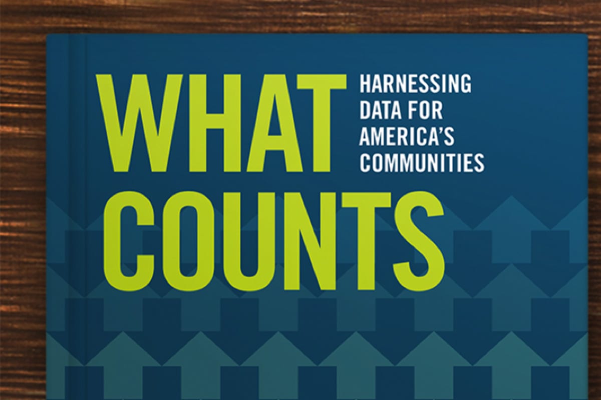
-->When our friends at the Federal Reserve Bank of San Francisco (FRBSF) asked us to help build a website for their latest book, What Counts: Harnessing Data for America’s Communities, we saw three things: ambitious goals, a tight timeline, and a challenge that we couldn’t pass up.
As data nerds ourselves, we strongly believe in the power of information to help communities make smart decisions. Our team was eager to jump into the project. With a tight timeline leading up to the early December launch, we needed to think strategically to make a strong, attractive, and easy-to-navigate website for the book a reality.
Here are three lessons we learned as we moved from sketching ideas to launching the What Counts website in record time:
- Keep it simple. Our partners at FRBSF had one goal that rose above the rest for this website: give people access to the book in multiple ways. Whether it was reading the book directly on a phone or tablet, downloading a single chapter or the full book as a pdf, or ordering print copies, easy access to the book was paramount. With this in mind, we designed a simple navigation structure to give users quick access to the book content, created attractive action buttons –read, download, and order—and repeated them throughout the site, and used a responsive theme so the site would look great on any device.
- Choose a premium WordPress theme. We love custom design as much as the next web developer. Building out every detail of the information architecture from the ground up is important for many sites, and allows your site to feel unique. However, when you are under a tight timeline and your audiences’ needs are clear and simple, a theme can help speed up the web development process. Premium themes from groups like Themeforest and Themezilla are useful because they are easily customized, have strong built-in functionality, and are often fully responsive (meaning that they are mobile friendly). That said, you don’t want your website to look like everyone else’s. This leads me to our next strategy…
- Use design to make it feel custom. The theme we chose—Sparks—is a theme for a portfolio site, and it relies heavily on graphics. We knew that the concepts in the book would be difficult to represent with photography, and that much of the photography choices would feel too “stock.” So we decided to go a different route with our imagery: icons and custom representation of the book. As we read through the book, we pulled out key concepts that could be represented through icons. We chose five icons that illustrate the key concepts: measurement, networks, neighborhoods, playful spaces, and health. These images add visual interest throughout the site, without relying on stock photography. They also help make this theme unique to the What Counts book.
Naturally, there was a lot more that went into creating this website—a dedicated team at FRBSF and the Urban Institute, a great book design to build from, and compelling content from all of the book contributors were critical to the success of this website. We love a good challenge, and are proud to have been part of the team bringing this book to the public. We hope you’ll dive in and learn more about What Counts!

