Short Distances to Large Gaps in Health
By Megan Salzman, May 4, 2015
We all have a role to play in improving health. It is not just doctors or hospitals that are responsible for keeping us healthy—it’s also the people who teach in schools, pass laws, run businesses, and raise children. And so it is up to all of us to tackle the reality that opportunities to lead a long and healthy life, can vary dramatically in our communities.
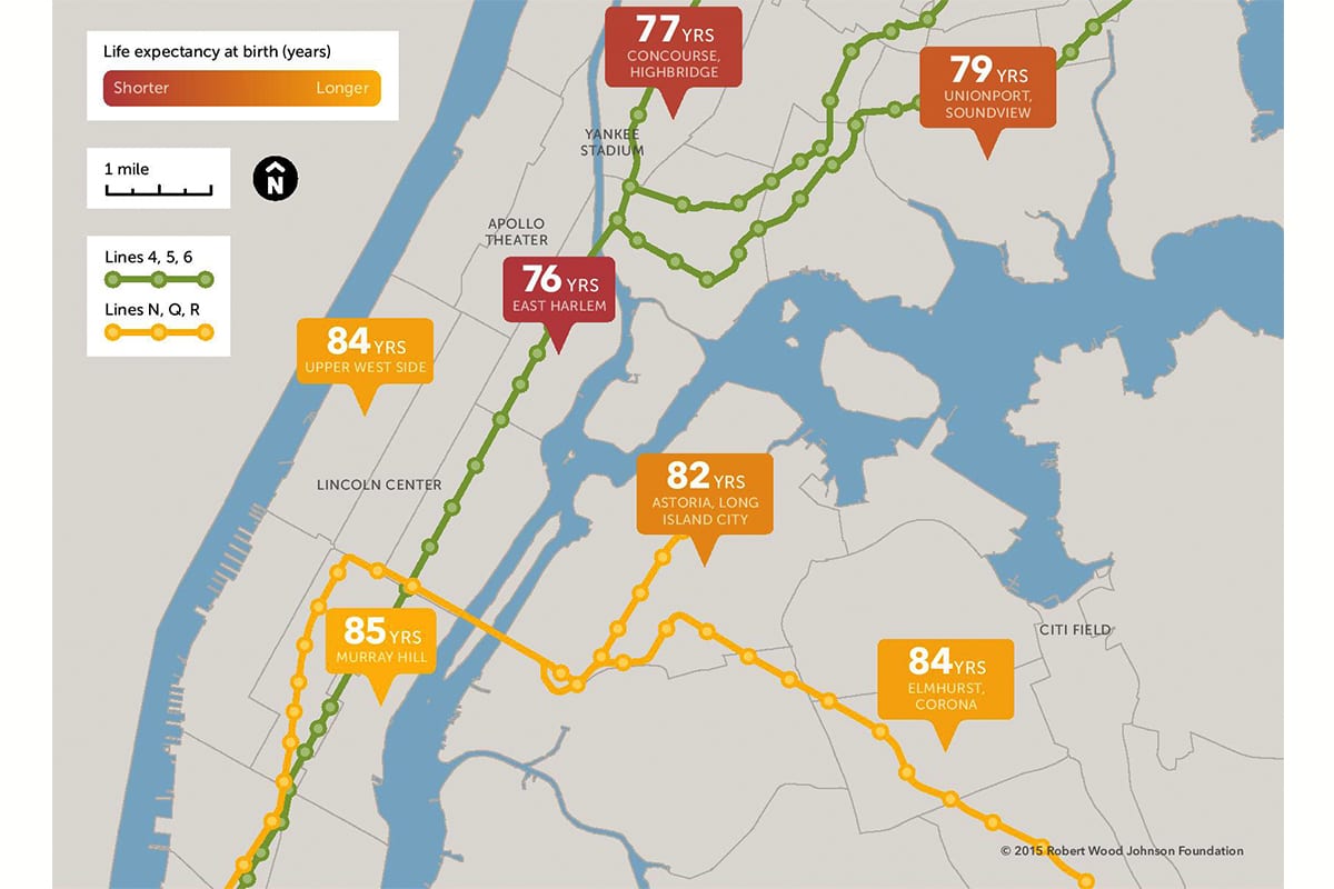
Last week, the Virginia Commonwealth University (VCU) Center on Society and Health and the Robert Wood Johnson Foundation (RWJF) released four new maps (on Twitter at #CloseHealthGaps) illustrating how large gaps in health can exist in very short distances. The maps—which show the wide variations in life expectancy for babies born within miles of one another in New York City, Chicago, Atlanta, and Richmond, Va.—underscore how important it is to build a Culture of Health where getting healthy, staying healthy, and making sure our kids grow up healthy are top priorities.
Health disparities based on where you are born or where you live are not unique to big cities, small towns or rural areas—it’s a pattern across America as a result of varying neighborhood conditions. The reason that health varies so much by neighborhood is rarely due to a single cause, but instead a web of factors that influence health, such as opportunities for education and jobs, safe and affordable housing, or availability of nutritious food and places for physical activity.
In releasing the maps, VCU and RWJF pointed to local efforts to address the many factors that affect health, including: the Atlanta Regional Collaborative for Health Improvement; the Healthy Chicago 2.0 initiative; the New York State Health Foundation’s Healthy Neighborhoods Fund initiative; and a new partnership involving the VCU Health System Virginia Coordinated Care program for the uninsured, the VCU Office of Health Innovation, the Richmond City Health District and the Institute for Public Health Innovation.
As you can see, there is no one-size-fits-all solution to helping people live longer, healthier lives. Each community must chart its own course. And we all have a role to play.
To read more about the life expectancy maps, explore these articles:
Same City, But Very Different Life Spans – New York Times
Babies Born 3 Miles Apart in New York Have a 9-Year Life Expectancy Gap – Vox
Where you Live in Atlanta Affects Life Expectancy – Atlanta Journal Constitution
Healthy Communities A Matter Of Life Or Death – Richmond Times-Dispatch
Life Expectancy By Chicago L Stops — The Stark Data – Chicago Sun-Times
