Making Data Useful
By Jemma Weymouth, May 8, 2017

Having data is great. But having data that is easy to use is even better.
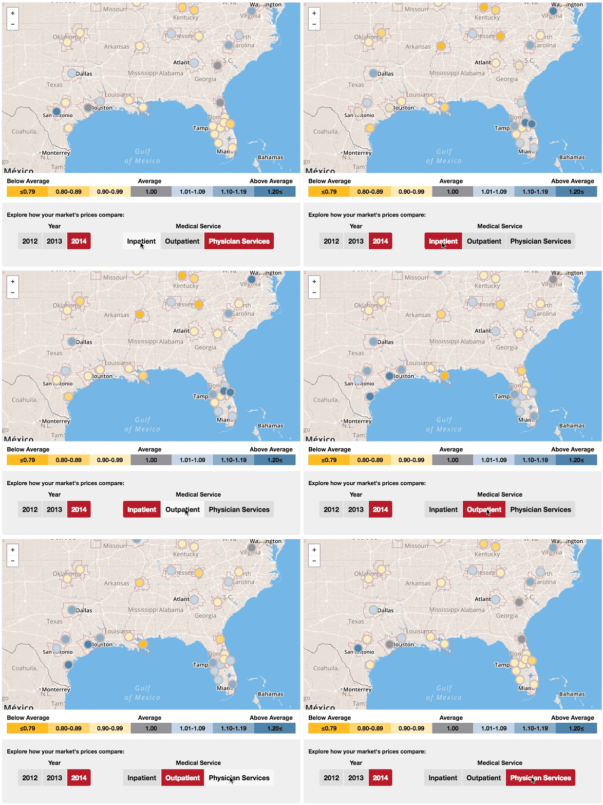
The Health Care Cost Institute developed The Healthy Marketplace Index to help people interested in health care policy better understand what is going on with health care costs in their communities.
Are prices for outpatient care in Houston actually high? How do they stack up against prices in Dallas, San Antonio and even similarly-sized cities like Philadelphia? How do they contrast with prices for inpatient care?
Reporting the data as an index transformed it into a tool for local policymakers, employers and health care providers, enabling better comparisons and providing a benchmark with which to assess their health care markets.
Taking that index and plotting the data on a map, using a color code to indicate high vs low prices, and creating an interactive feature that allows users to toggle between data sets made the index even easier for communities to spot patterns, make comparisons and, ultimately, identify problems to fix.
Data visualization is a critical tool that all researchers should embrace if they want to turn information into action.
